D S G N
ZF Aftermarket Platform
Executive Summary
The ZF Aftermarket Platform serves as a pivotal tool for automotive distributors and workshops, that are using ZF products and/or solutions, enabling them to efficiently purchase parts, book trainings, provide diagnostics and access critical information required for their operations. As a leading global supplier of mobility solutions, ZF Group's Aftermarket services must uphold the highest standards of utility, usability and disireability to stand out from the pack. It should be reliable and efficienct to meet the diverse needs of its users.
However, ZF as an industrial company with a very long and rich history alongside with the benefits inherited also the main problem industrial companies usually have. They communicate to their customers from the perspective of what they produce and provide, not from the perspective what the customers get and what problems the products and solutions solve. So the change in the company paradign was one of the aspects of the UX work. It was necessary to highlight how ZF can benefit from a strategic approach to improved user-centered design principles.
Additionally, as the landscape of digital tools evolve and user expectations grow, maintaining an optimal user experience becomes paramount. Users in B2B nowadays expect to get same frictionless experience as users in B2C. So, to ensure the platform not only meets but exceeds user expectations, it was crucial to analyze and address existing pain points while envisioning innovative improvements.

Creating Personas and Identifying User Roles
First things first. Distributors and Workshops are the main (but not the only) user groups of the ZF Aftermarket portal. But they have very distinct goals, motivations, and pain points when interacting with the platform. They have also very different possibilities after login. So conversion for each group will mean a completely different set of actions.
Developing detailed user personas based on research findings provided a clear representation of these user groups. Personas helped to create the user survey and guide design decisions, ensuring the platform is tailored to address specific needs and scenarios. Additionally, mapping out user roles (as each of those groups might have different roles too) helped to clarify the diverse ways different stakeholders interact with the system, revealing opportunities to streamline workflows and reduce friction.
In addition to Persona Cards for internal use, we decided to make also big posters and have thm on our wall. So, some analytical work became spiced up with some graphic design work for me. Soon after, our new posters appeared on our wall, which greatly helped also people that are not connected to UX or IT at all to undersatn dbetter the person on the other side of the monitor or phone.

The Need for Research and Empathy in UX Design
To propose effective enhancements for the ZF Aftermarket Platform, it was vital to conduct comprehensive user research. This involved gathering qualitative and quantitative insights into the behaviors, preferences, and challenges faced by the platform's users, who include distributors and workshop technicians. By understanding their unique contexts, roles, and requirements, the design process can be informed by real-world needs rather than assumptions.
We have conducted a dozen of direct interviews with local worshops and distributors in the Czech Republic. But as ZF Group is a global company, the user research cannot be considered acceptable if only users from one region are questioned, thus we used the knowledge taht we harvested during the interviews to create online surveys that could provide appropriate results additionally from 4 different key countries: Germany, Brazil, Turkey and Poland. The geography is supposed to grow and the survey should be recurrent, to measure the impact on the UX after the improvements that have been implemented. Tools used for distribution and analysis: Qualtrix and Pardot.
User Journey Mapping for Deeper Insights
Analysis of the information collected during user interviews and the statistics harvested by conducting the multi-regional surveys helped to create User Journeys - step-by-step experiences of navigating the platform - to help uncover critical moments where the platform excels or falls short. This includes identifying areas where users were encountering frustration, delays, lack of information or confusion. Understanding both the highs and lows of these journeys, made possible to see the opportunities to enhance efficiency and satisfaction.

Addressing Negative Sentiments
Feedback on the current solution often revealed negative sentiments such as dissatisfaction with complex navigation, insufficient search functionality, or a lack of intuitive design. As ZF Aftermarket Portal is first of all a huge catalog of products (with more than 1.4 million parts), those aspects were crucial for the users.These pain points were leading to inefficiencies, frustration, and decreased engagement. By thoroughly understanding and addressing these issues, the ZF Aftermarket Platform can evolve into a more user-friendly and effective tool.

Objective of the Project
Leveraging insights from user research, personas, user journeys, and sentiment analysis, I led the UX team to propose actionable recommendations to optimize the platform's usability, then created the prototypes and worked alongside with the developers to turn the prototypes to live dynamic pages. This helped to foster positive user experiences, and align the commitment to excellence in customer experience with ZF's long-standing commitment to excellence in mobility solutions.
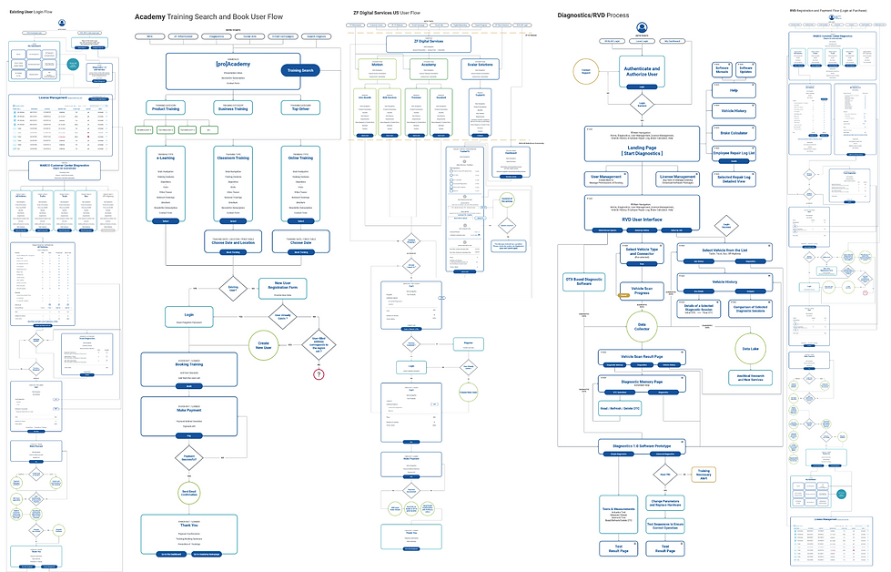
Statistics, Analysis, Flows and Wireframes
The beauty of digital presence is that almost everything can be measured. Based on the usage statistics we knew that more than 94% of our customers are coming to our portals to look for a product or part. So we give the search box a dominant position on the homepage.
As Search is so important to our users, we have to do a thorough research and competitor analysis to understand how to organize it the best:

More Flows and Wireframes...
Several additional very complex wireframes for different flows like ZF [pro]Academy trainings, ZF[pro]Diagnostics etc. and we were finally ready to proceed to the designing stage...
The Corporate Branding and Styleguide
As every big corporation, ZF had its own corporate guideline. But surely there are some finetunings that are usually necessary to do to adapt the corporate styleguide to digital implementation. E.g. I had to do a research and replace the corporate ZF Sans to Roboto for the web, due to redability, render quality on the screens, etc. And of course the digitalk styleguide comes with all those atoms, molecules and organisms, that help you create more complex layouts afterwards.

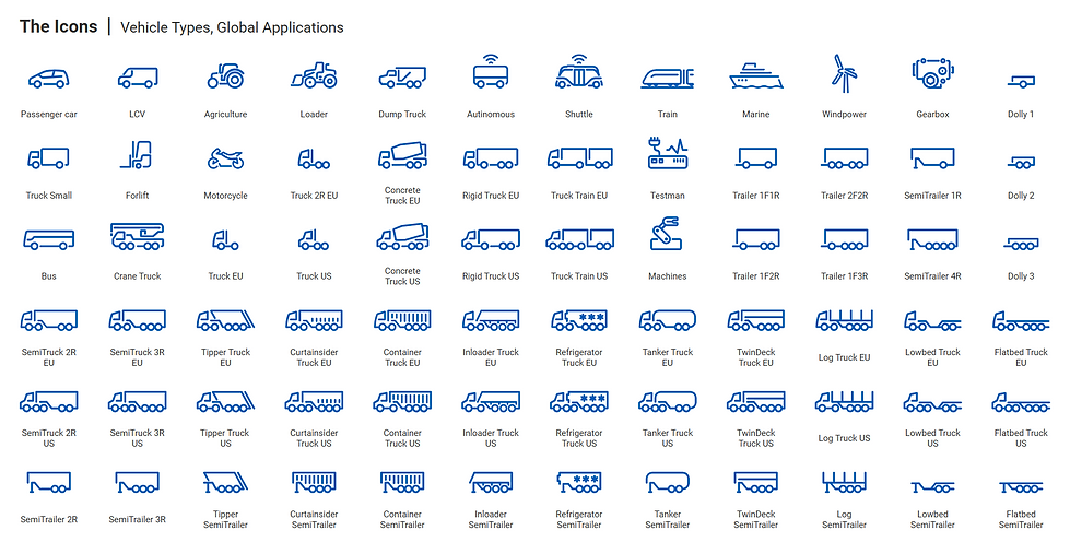
Iconography
Another library that is usually is taken for granted is the icon one. But as it often happens according to the universal rules of the Merphy's Law, when you need some specific icon - it is usually not there. Having a long experience of graphic design I was able to follow strictly the guides and create all the missing icons that were necessary, as well as proposed improvements to existing ones.
Navigation and the Mega-menu
The contents is huge, so, to make it easy for the customers to navigate and to propose easy and intuitive navigation we decided to divide it to 2 sections: what we offer and user oriented proposals. This means that both, either the users who khow what they are looking for or the users that are coming to see what we can offer for them, have a clear entry points via the navigation.
As the structure is very complex, with may sections, levels and sublevels, I did not find a better option than a mega-menu. Of course with full functionality also on mobile version. And to avoid wasting space when not all the sublevels are open, a promotional banner related to the opened level topic can be used.

Search VS Navigation and the User Interface
The importance of UI is difficult to overestimate. As this is afetr all a catalof with both public and gated content, users are visiting it to find products. And then the conversion might be either looking for the technical documentation of thet product, or purchasing of it. Clear and comprehensive navigation, understandable icons, intuitive interactions are a must for any project.
I used also some subconscious tactics. This was the first catalog to unclude all the products from all the 5 ZF umbrella brands: LEMFOERDER, SACHS, TRW, WABCO and BOGE. So, to highlight that the catalog will include all the brands we have integrated all the brand logos into the banner. They are very subtle and not noticeable from the first view, because we do not want to divert the user’s attention from his main task, which is the search. But nevertheless, we give a subconscious hint of completeness with included brands as well as some excitement of a discovery when the user finally notices them.

Big Catalog Difficulties
One of the biggest challenges of building a huge catalog of more than 4.000.000 parts is being flexible enough with the layoiut to include dynamically all the information harvested from the Project Information Management database and display on the page. Some product have more information, some have less. Sometimes it is really extremal. And your page should look good no matter which case it is.
